

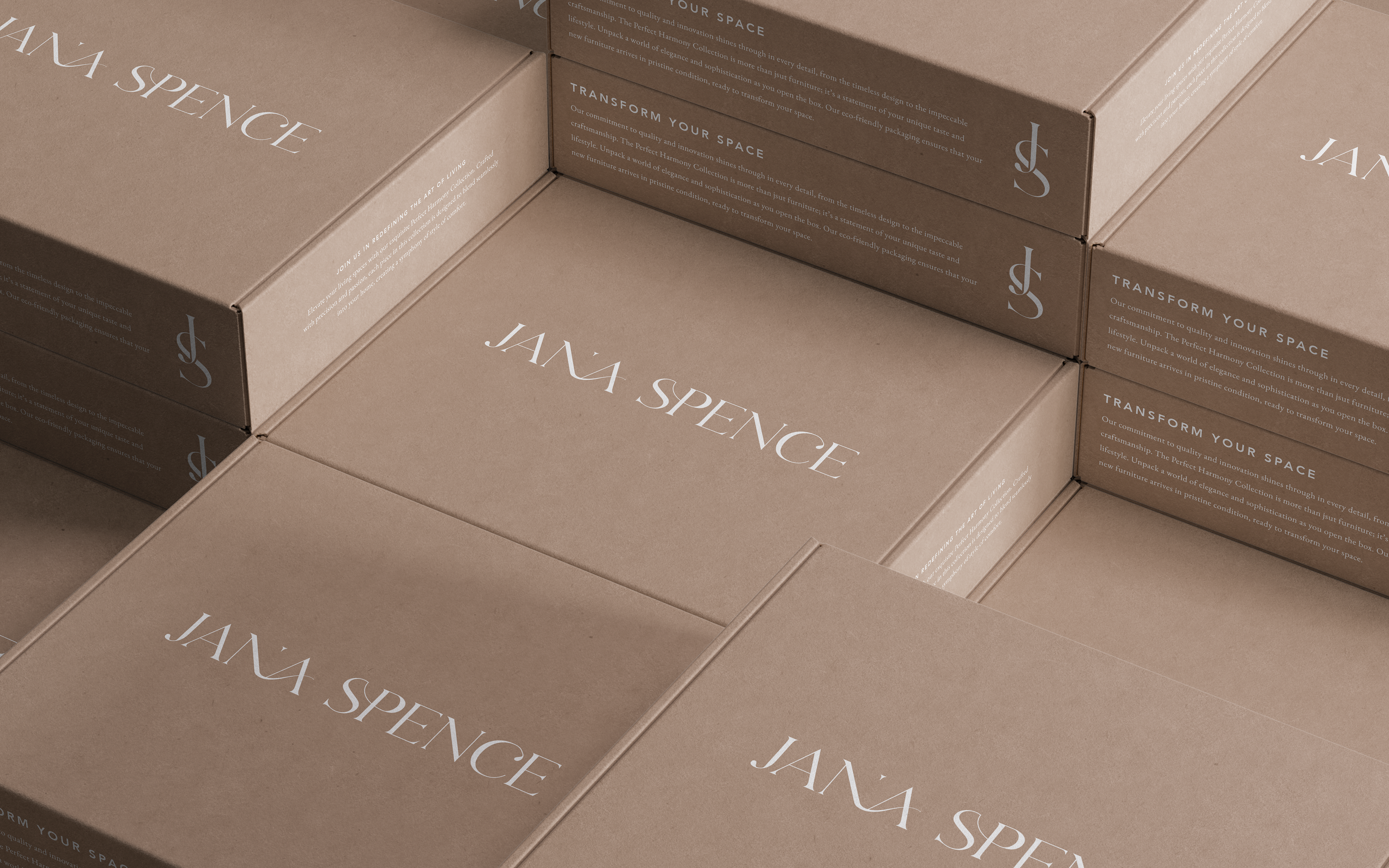
The Brief
Jana Spence is a talented furniture designer specialising in made-to-order, handcrafted pieces. Her business was born out of frustration with cheap, low-quality furniture dominating the market, and her mission is to create furniture that’s both beautiful and built to last.
My goal was to craft a visual identity that reflects Jana's commitment to creating timeless, durable furniture and her core values of quality, collaboration, and creativity.
Deliverables:
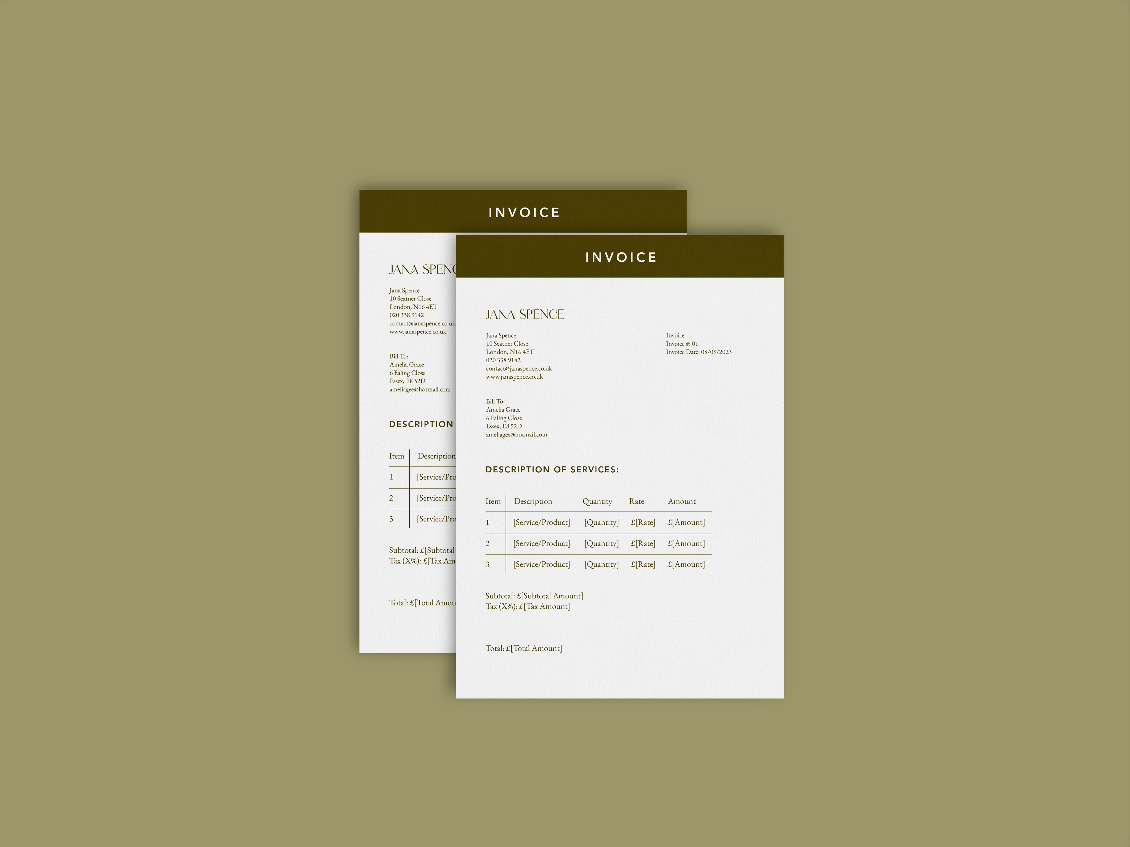
✺ Logo Suite
✺ Typography
✺ Colour Palette
My Approach
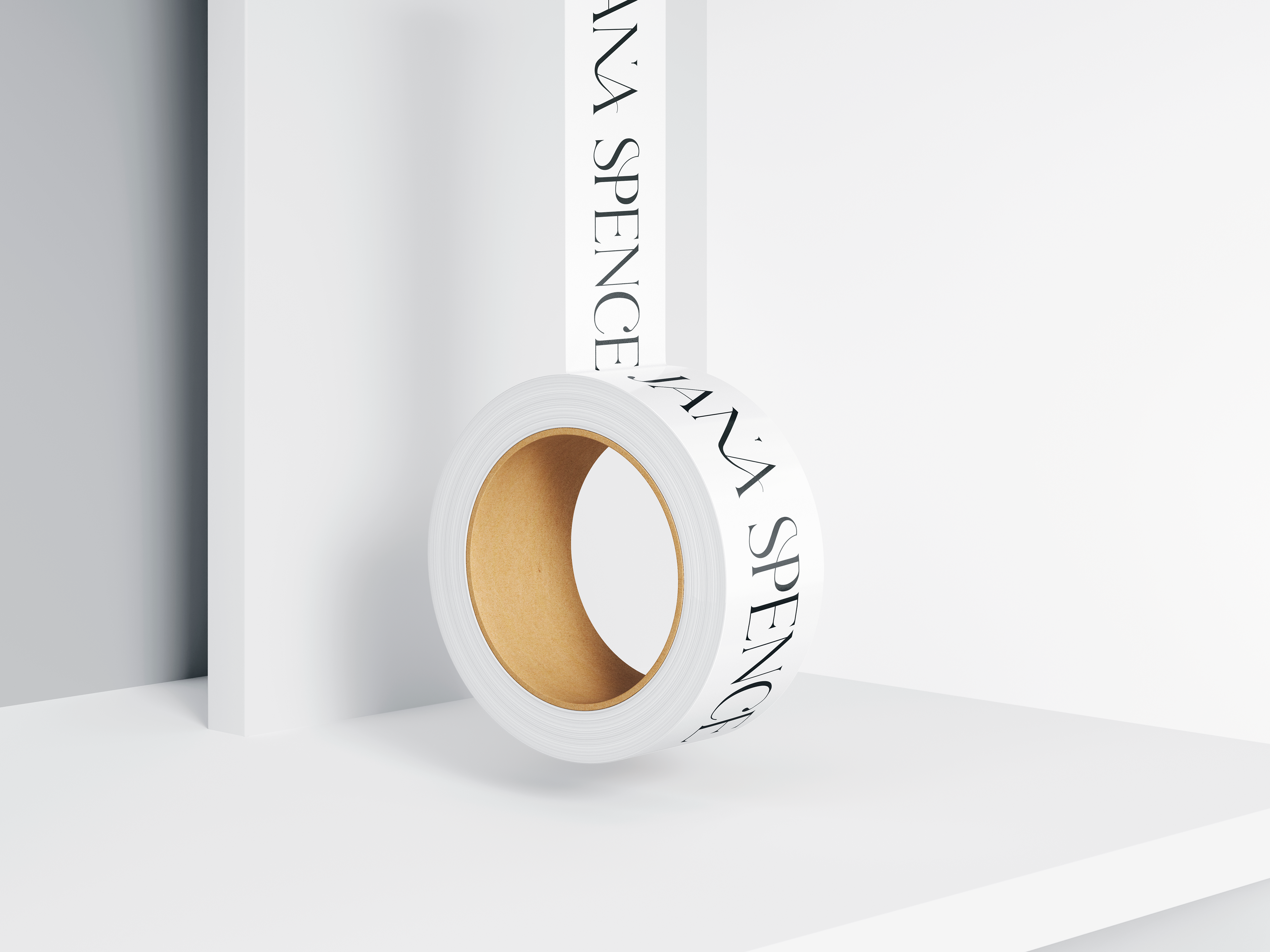
To create a visual identity that embodied elegance, sophistication, and timelessness, I drew inspiration from the client’s love for minimalism and artistic expression. I selected earthy tones for a grounded feel, pairing them with a rich, saturated brown to evoke a sense of luxury.
For the typography, I chose a soft, slightly feminine serif font to balance tradition with modernity. Then, I introduced a continuous flow between the letters to add a sense of movement and uniqueness, ensuring the design felt cohesive and memorable.
The result was a refined identity that speaks directly to clients who value quality, artistry, and investment-worthy furniture.

"Working with you has been such an amazing experience! You were so organised and professional, and the work you produced was of such a high standard! I was so impressed with how you captured my vision and produced moodboards that fit my aesthetic perfectly. The final result was better than I could have imagined. Thank you for everything! P.S. I would definitely refer you to a friend 😉"
Jana Spence