Instagram Audit
Brand Strategy
Visual Identity
SOCIAL MEDIA DESIGN
The Brief
Lagoon had always existed as a feeling, lifestyle, and bond between friends. But, now it was time to turn that spirit into a brand! Their old look didn’t reflect the quality or intention behind their work. With plans to host bigger events, they needed to look the part. They needed a new visual identity and a clearer brand direction that felt cool, nostalgic, and familiar, like a good throwback and a safe space all in one.
The Process
I began by auditing Lagoon's social media, reviewing content, bio, hashtags and engagement to understand what was working and where the gaps were. From there, I built a focused brand strategy designed to support growth while protecting Lagoon’s big-dream energy.
We skipped generic mission & vision exercises and focused on what would create greater clarity: brand positioning, audience personas, brand voice and creative direction.
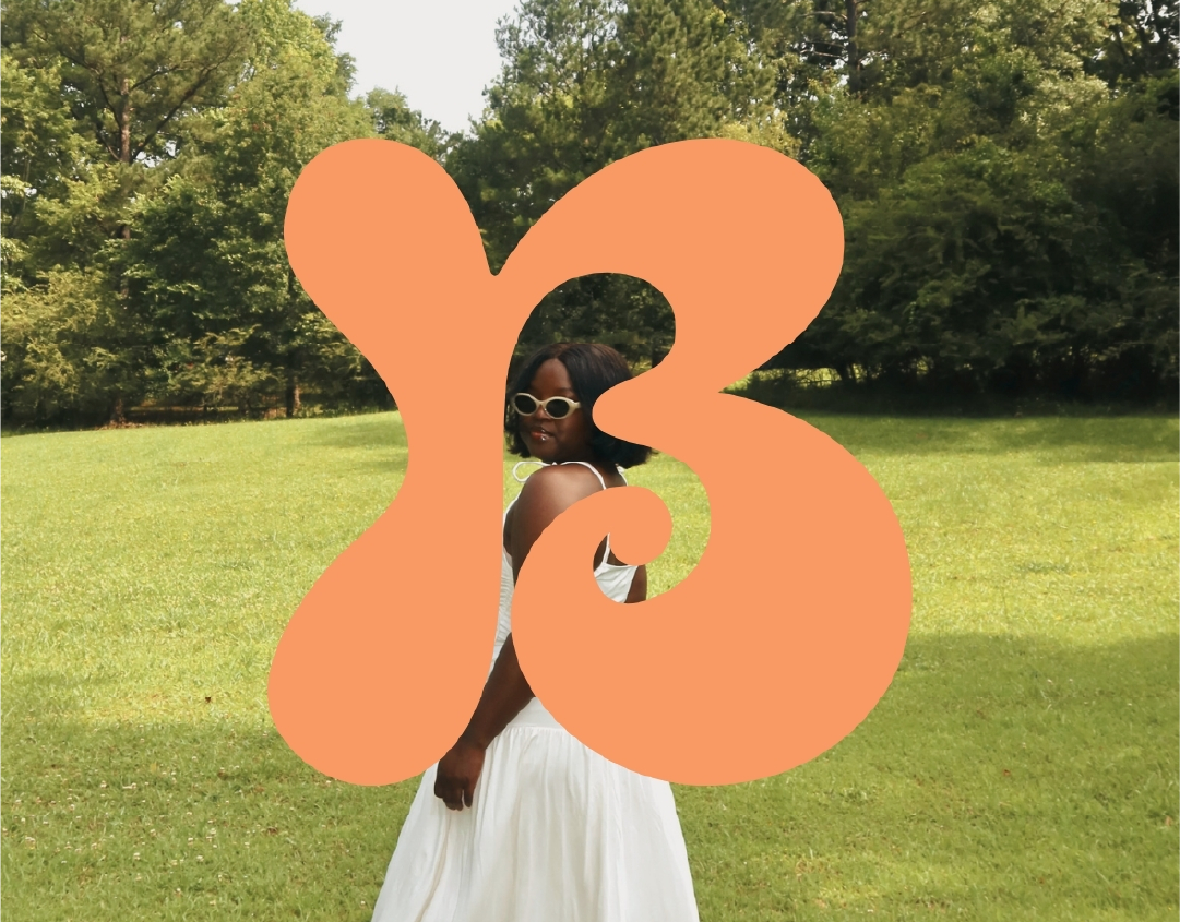
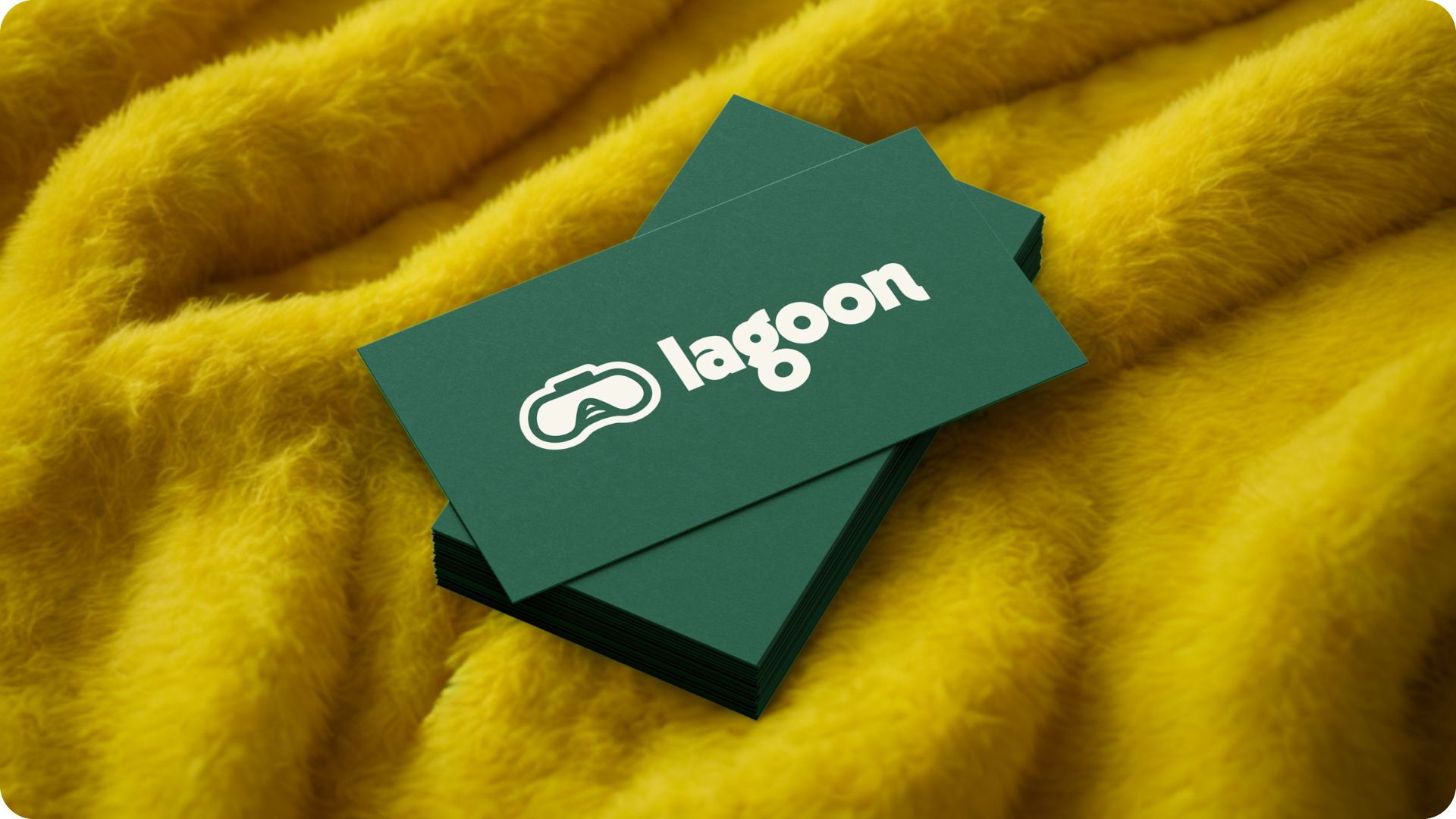
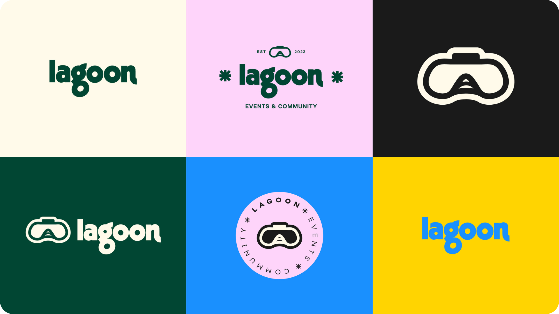
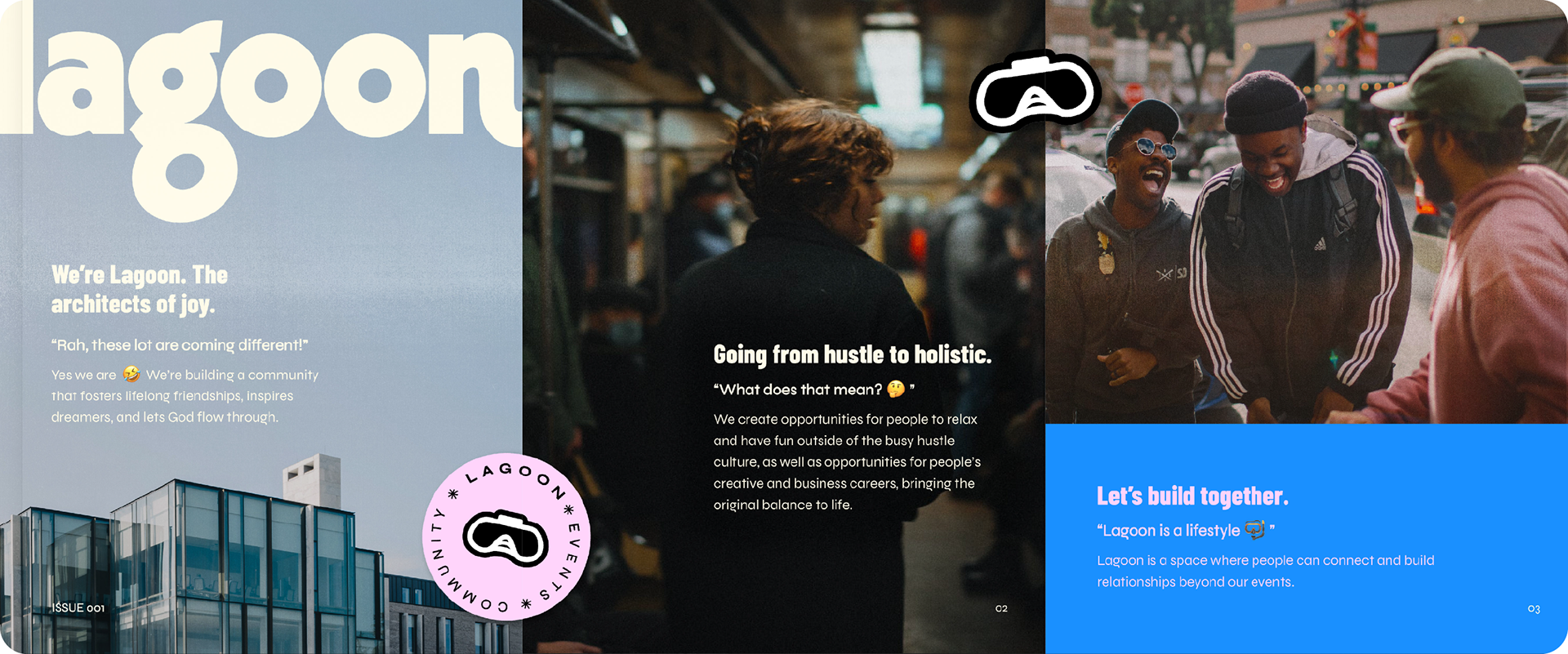
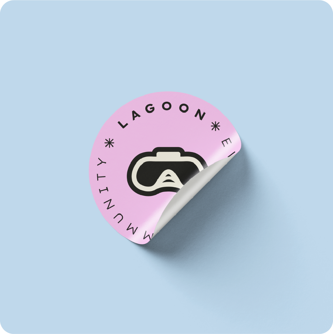
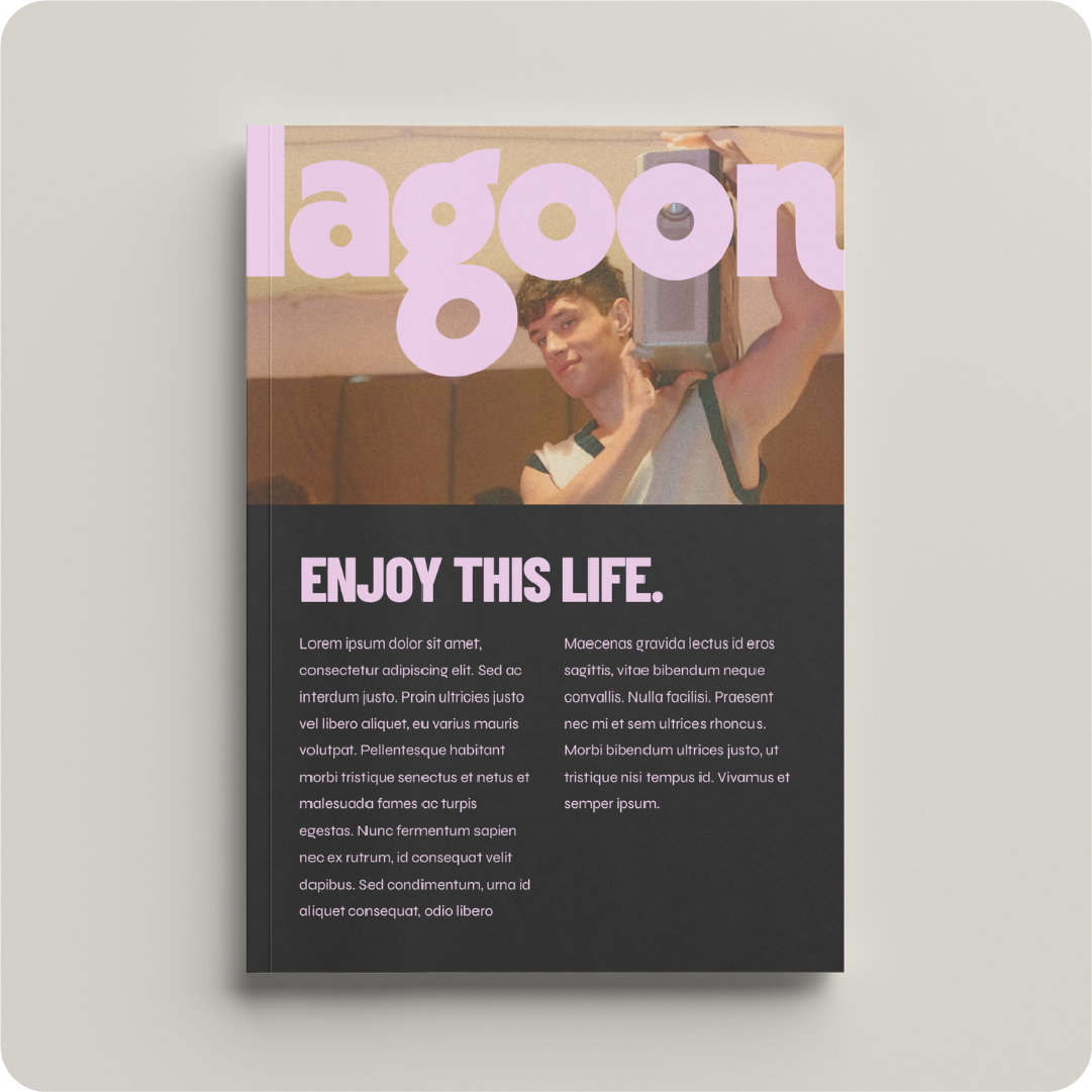
Design-wise, we went bold! A custom lowercase wordmark kept things grounded and approachable, while asterisk details and an extended “N” introduce movement and play. The playful colour palette is balanced with darker green and baby pink to hold both vibrancy and maturity. Editorial-inspired typography and grainy, retro imagery tie it all together with a confident, culture-led feel.
The Outcome
The founders loved the identity straight away – not a single revision was needed. They said it captured everything they’d imagined. Lagoon's new brand strategy gave them the clarity, language, and confidence to move intentionally.
They hosted their first major venue event in 2024 and it sold out, people even tried to get in at the door! Their branded shoot was a perfect match for the vibe, and every post, event and rollout since has carried that same Lagoon energy: bold, playful, rooted in joy.
Here's what the team said:
“Rayanna helped bring our brand to life, making it possible for us to have a professional brand that looks cool and inviting. It was such a smooth and enjoyable process! She took the time to understand exactly what we wanted and reassured us that we’d receive everything in its highest quality. Since launching, our first major event sold out with guests turned away at the door. Our content has been widely shared and saved, helping us grow a 60+ member WhatsApp community, secure collaborations, and organically attract a new audience on Instagram & TikTok!”
Ayooluwa, Joshua K. & Joshua S. – Founders of Lagoon