The Problem
Elliot had a powerful message but no clear visual identity to hold it. His current logo felt generic, the font didn’t sit right, and the designs didn’t match the warmth or spiritual weight of his words. He wanted this poetry project to feel distinct from his professional brand: something softer, more organic, and rooted in faith. Tools like Canva weren’t giving him the clarity or creative freedom he needed. More than just “good design,” he was looking for someone who could understand the emotional and spiritual depth behind his work and translate it visually.

The Solution
I began by inviting Elliot to share the heart behind his poetry and what he wanted readers to feel, remember, and hold onto. From there, I shaped a visual direction that felt nostalgic, minimal, and warm.
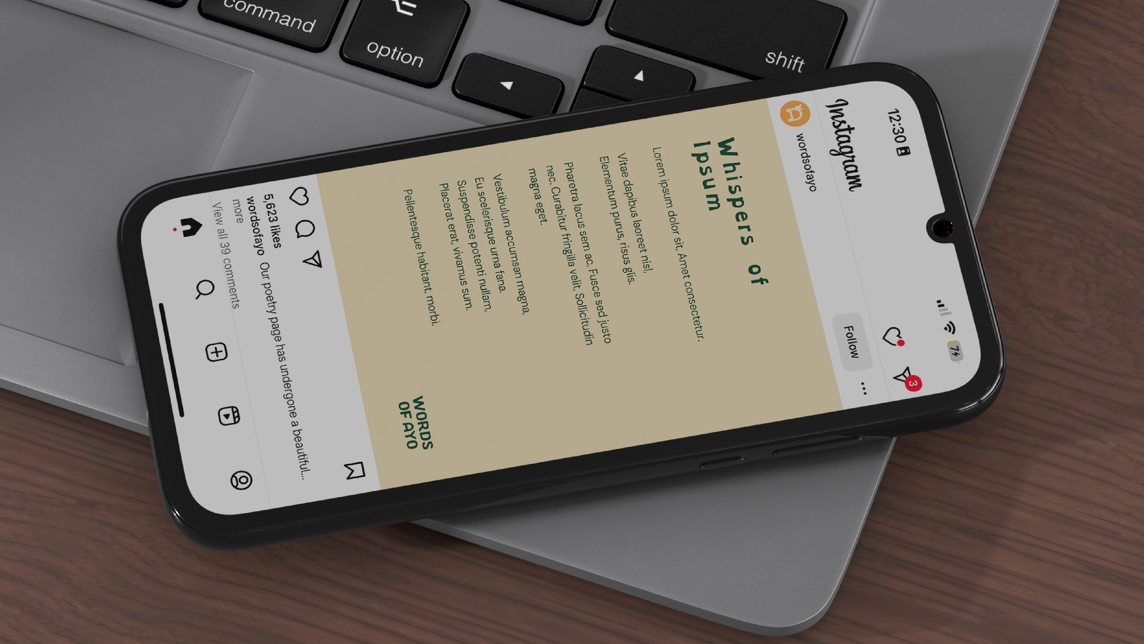
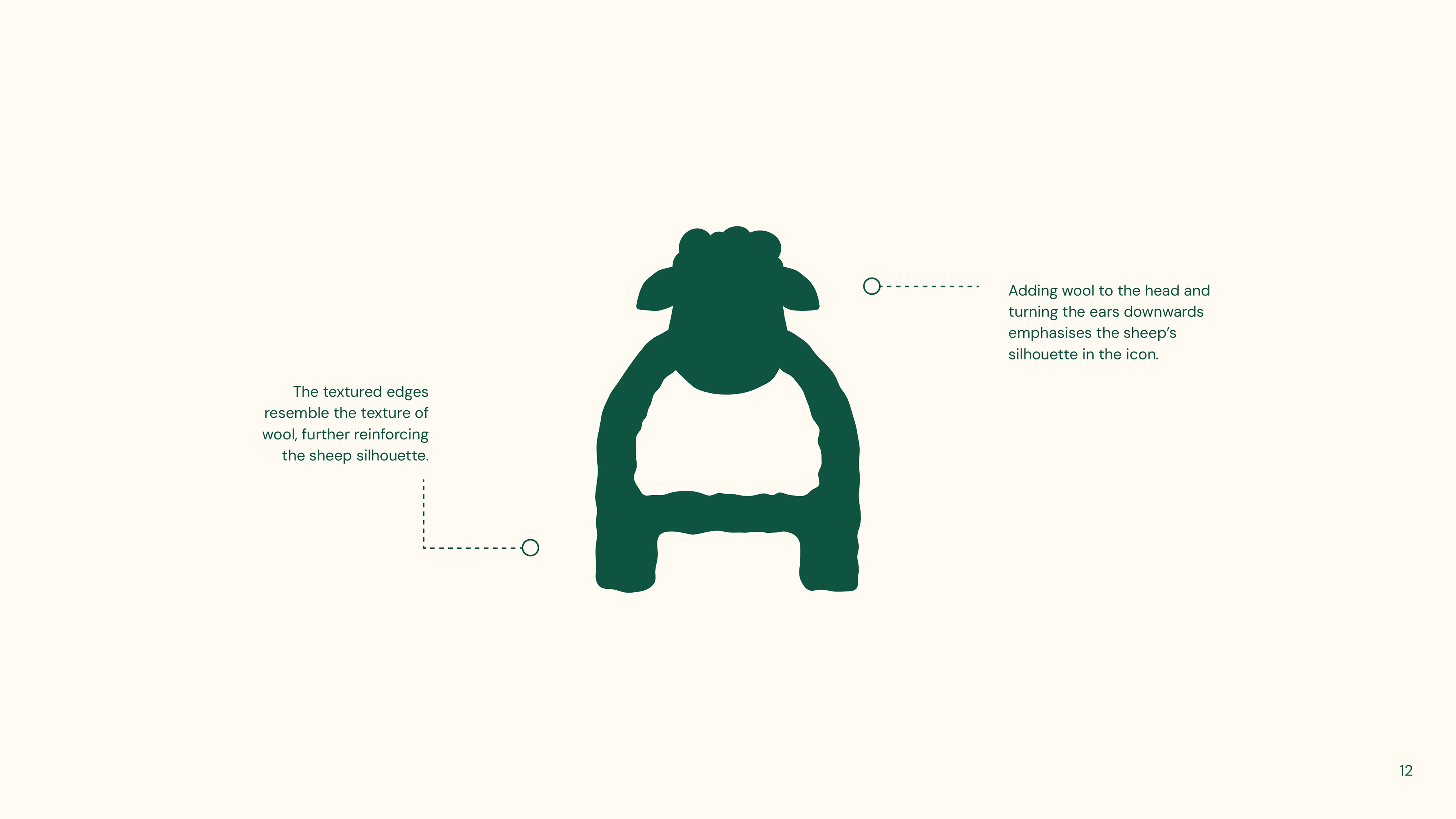
The colour palette initially began with earthy greens with golden yellows, evoking nature, hope, and divine light. Typography leaned vintage, pairing retro display fonts with clean sans-serifs and a touch of handwritten charm. The logo merged clarity with a gentle playfulness: the letter "A" was customised to form a sheep’s head, tucked inside the icon, symbolising rest, humility, and care. This created a subtle symbol of being known and carried, without overstatement.
Intentional use of white space gave the page a breath of fresh air and creative openness. Altogether, the brand identity reflected the poetic nature of Elliot’s work: honest, thoughtful, and rooted in something bigger.
The Outcome
What started as a single design project grew into an ongoing creative partnership. Ayo later came back for two more projects, trusting me to adapt the visual tone for each one. He said:
"I am so grateful for the support. It's been so valuable that we ended up working together on 3 different projects. All completely different, but the service was well adapted and tailored to the needs of each. Incredible!"
What I Loved
This project was all heart. I loved its softness and the way it didn’t need to shout to be powerful. The mission was clear from day one, and the creative direction flowed easily from that place. It was a joy to build something so simple, approachable, and full of meaning.