Brand Strategy
Visual Identity
SOCIAL MEDIA templates
Presentation templates
The Brief
When Vivienne, founder of Melanin Travel and an established travel journalist, reached out, she had a massive vision but a visual identity that couldn’t keep up. Founded out of her personal experiences backpacking through Asia, Melanin Travel was born to provide an informative, inspirational platform for Black travellers navigating the world.
While the community was highly engaged, Vivienne was ready to scale. But, her current branding didn't match her vision for a comprehensive B2B and B2C travel ecosystem. She relied on a single primary orange that felt restrictive and difficult to deploy across her social feed. She needed an expansive visual toolkit and a suite of digital presentation templates that could command authority in corporate rooms while remaining warm & welcoming to her core community.
The Process
The creative direction required a delicate balance: the look had to feel mature and professional enough to secure corporate brand partnerships, without losing the "cool, best-friend-next-door" energy that defined the community.
To achieve this, we made intentional, strategic design choices that purposely steered clear of industry clichés:
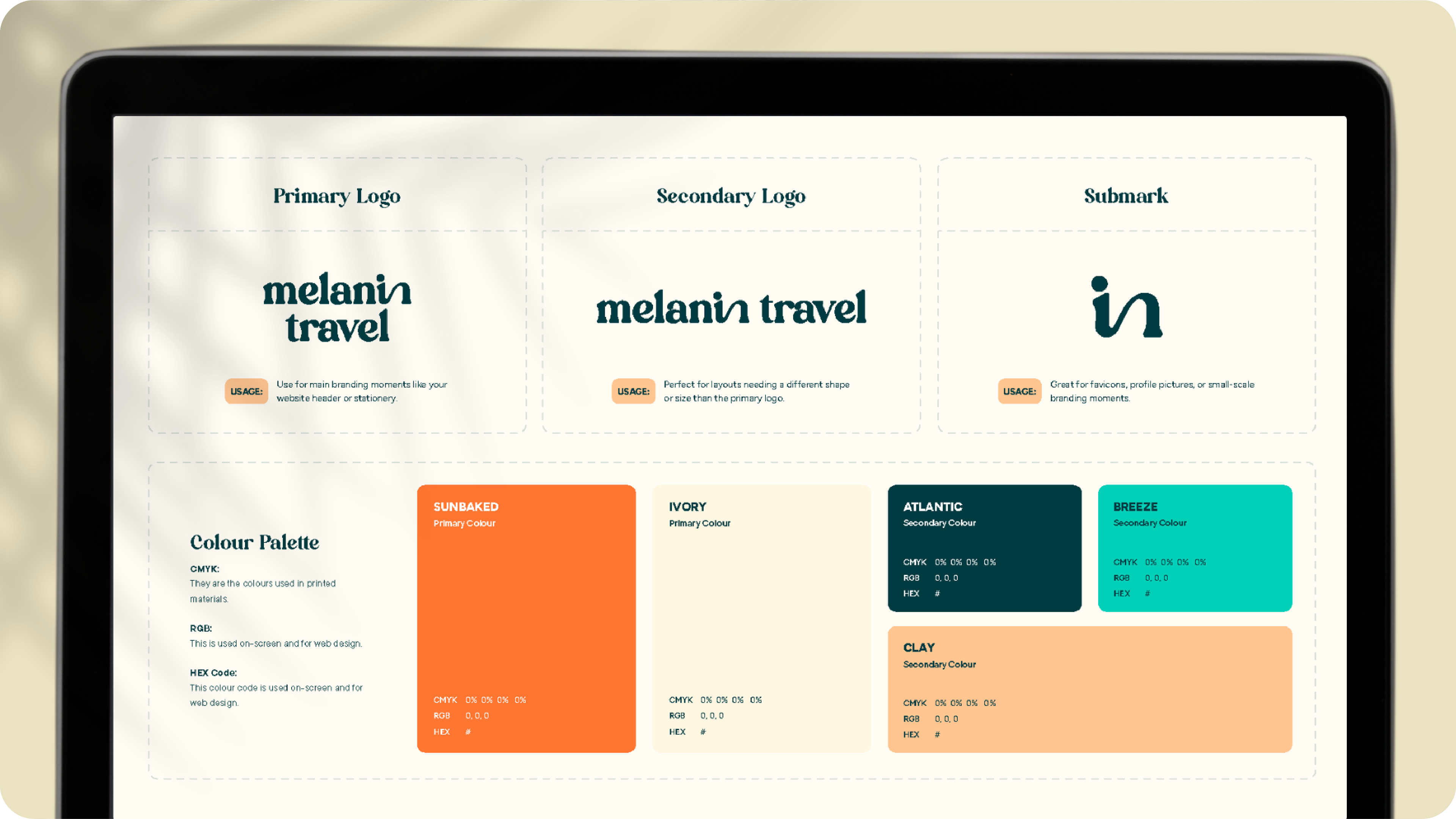
✱ Vivienne explicitly wanted to avoid standard "melanin" brown tones or predictable pan-African colour schemes (red, yellow, green). Instead, we elevated her signature colour into Sunbaked Orange, pairing it with a rich, grounding Atlantic Dark Teal, an inviting Ivory, and fresh accents of Breeze and Clay. This gave her a vibrant colour palette that feels clean, premium, and professional.
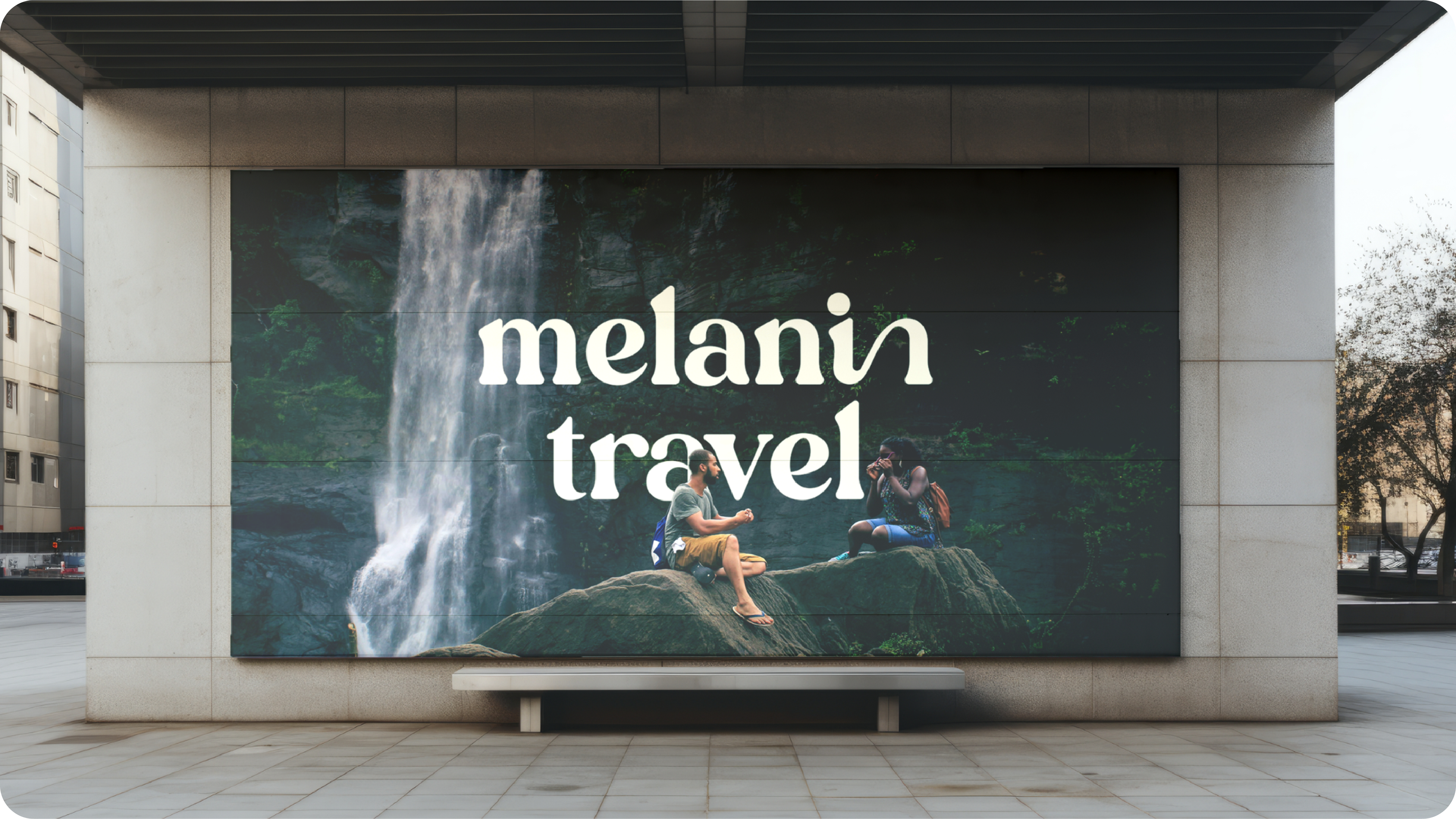
✱ While traditional serif fonts can feel overly corporate or unapproachable, we selected a fluid, expressive typeface for the wordmark that balances personality with structure. It feels modern, inviting, and highly legible across both high-end pitch decks and fast-paced social media feeds.
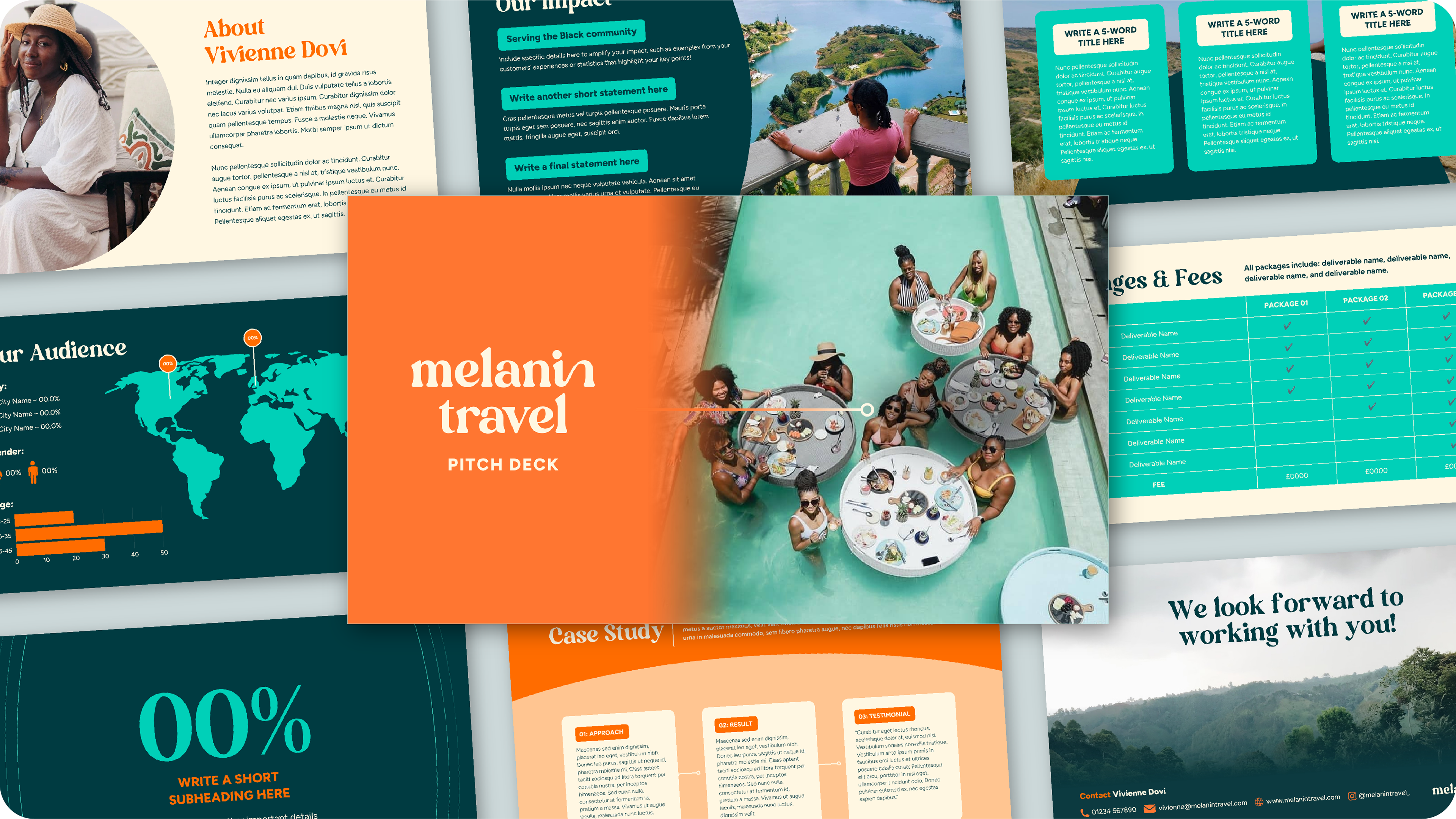
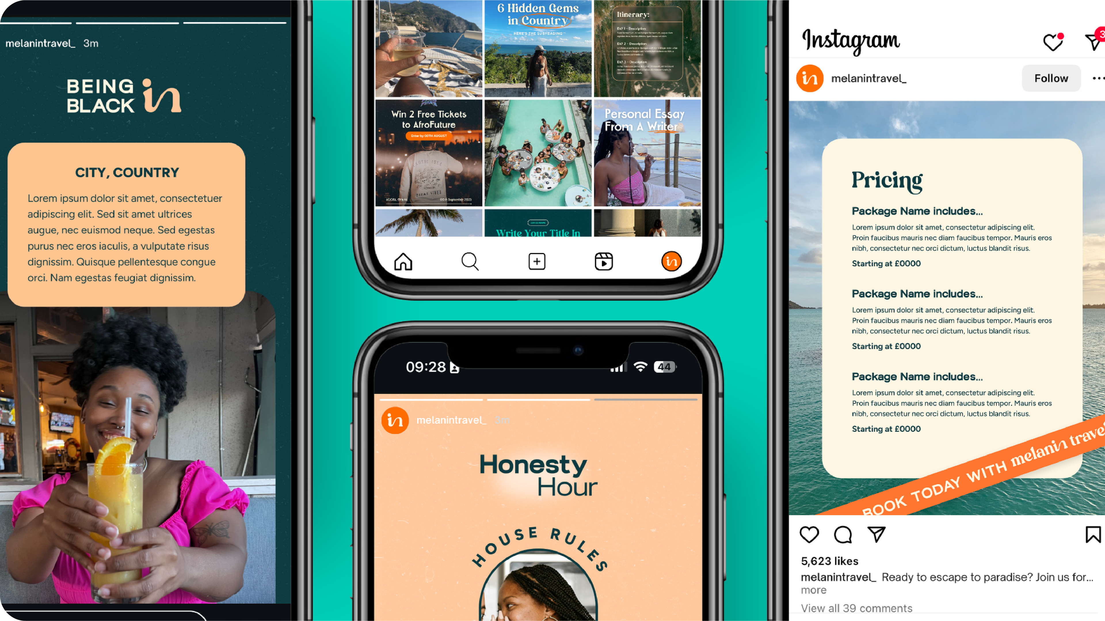
✱ To prevent creative burnout and save time, we designed highly functional social media frameworks and a master pitch deck. The design relies on clean layout blocks and distinct colour-coding rules, giving Vivienne a seamless way to separate organic community content, contributor features, and promotional materials without her grid ever looking messy or cluttered.
✱ We completely bypassed heavy-handed, literal cultural symbols. Instead, we created a fluid "in" submark that subtly hints at community, conversation, and the concept of travel alignment, built to grow in meaning over time.
The Outcome
While Melanin Travel’s new consumer-facing experience and membership platform are ready for a major launch later this year, the rebrand has already proven its weight where it matters most: in the real world.
Armed with a highly polished corporate pitch deck, Vivienne has stepped into high-stakes B2B spaces with absolute confidence. The visual identity has seamlessly transitioned from Instagram grids to large-scale, in-person corporate speaking engagements. It presents Melanin Travel not just as a passion project, but as a major, trustworthy authority ready to build a seamless tourism infrastructure across the African diaspora.
Ready to build your brand?